
n <- 10000
t_stat <- rt(n, df = 10)
hist(t_stat)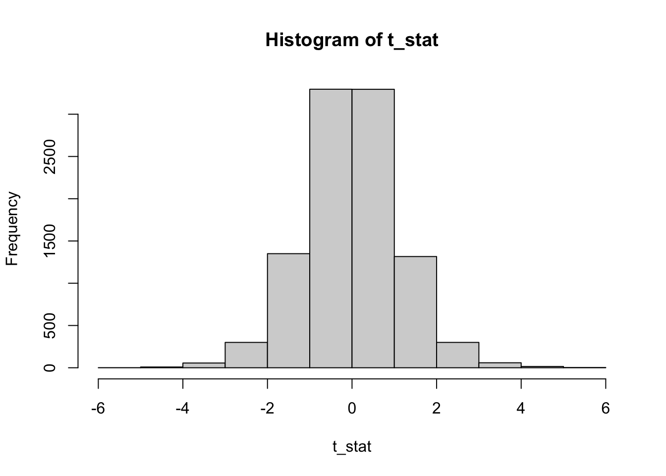
Our students asked us whether there is any good intuition on why the p-value of a hypothesis test has a uniform distribution if the null hypothesis is true. So I hacked up some basic visualizations.
First lets think about the quickest way to convince ourselves that the p-value is in fact uniformly distributed:
Assume we have a test statistic, that is t-distributed under \(H_0\). So lets sample some test statistics and plot their distribution:
n <- 10000
t_stat <- rt(n, df = 10)
hist(t_stat)
For a left-sided t-test with t-distributed test statistic, the p-value is computed with pt and we can clearly see, that these p-values are uniformly distributed.
p_value <- pt(t_stat, df = 10)
hist(p_value)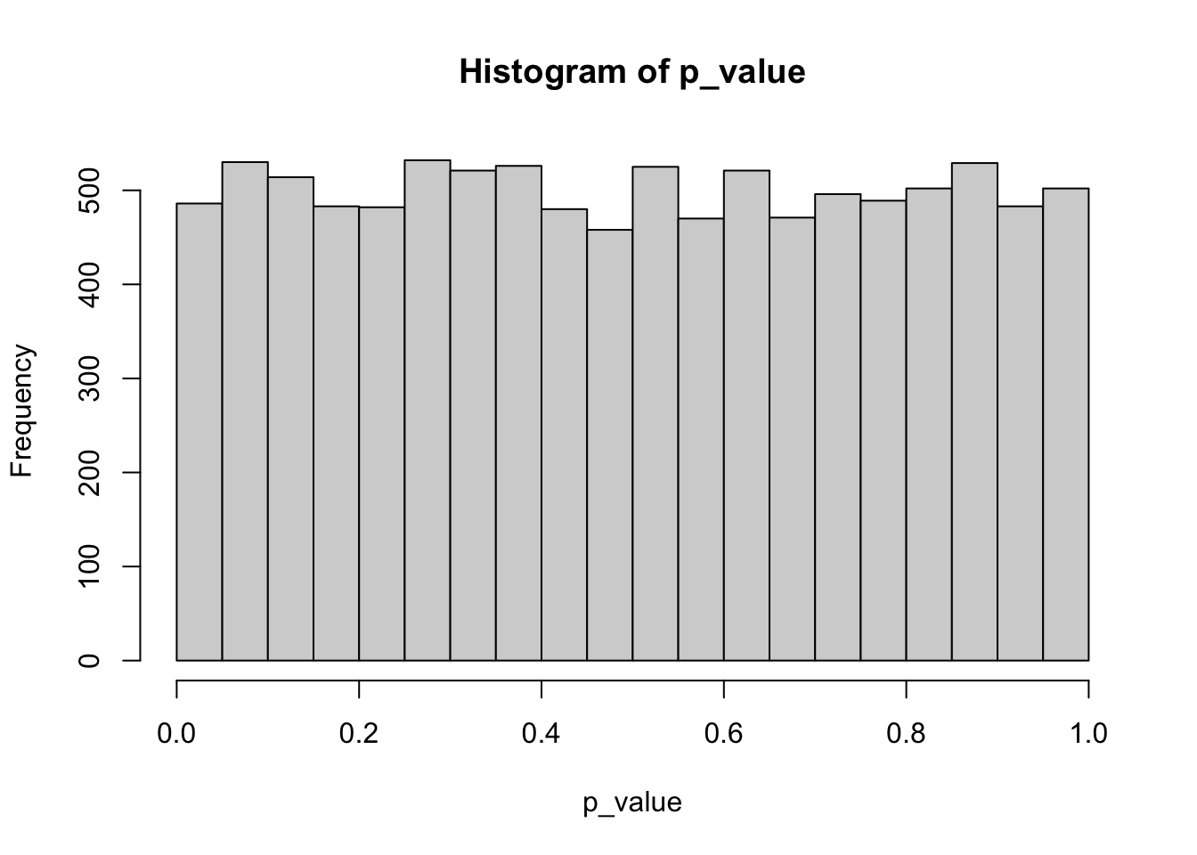
To build intuition on why the p-value is uniformly distributed under the null hypothesis, have a look at the following plots 1:
par(mfrow = c(2, 1), mar = c(4, 4, 1, 1))

# t-distribution with df = 1

curve(pt(x, df = 1), xlab = "", ylab = "p-value", ylim = c(0,1), xlim = c(-7, 7))
y_values <- seq(0.05, 0.95, by = 0.05)
x_values <- qt(y_values, df = 1)
segments(x_values, rep(-0.5, length(x_values)), x_values, y_values, col = "red", lty = 2)
segments(x_values, y_values, rep(-7.5, length(y_values)), y_values, col = "blue", lty = 2)
axis(side = 1, col.axis = "red")
axis(side = 2, col.axis = "blue")

curve(dt(x, df = 1), xlab = "test statistic", ylab = "density", xlim = c(-7, 7))
abline(v = x_values, col = "red", lty = 2)
axis(side = 1, col.axis = "red")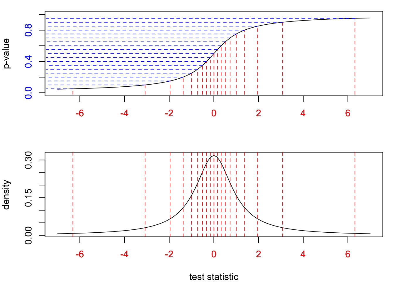
Per definition, a left-sided p-value computes the ratio of test statistics that would fall below the currently observed value of the test statistic (always assuming \(H_0\) is indeed true). On the top left side in Figure 1 we have divided the range of the p-value between 0 and 1 into equal blue intervals of length 0.05. Per definition, between two blue lines will fall 5% percent of values from the underlying test statistics. To achieve this equal percentage everywhere, the distribution function in the upper plot has to “collect” test statistics from a larger red interval on the bottom axis, when we move away from the mean. Close to the mean, we observe more values of the test statistic (as indicated by the density function in the bottom plot) so the interval that makes up 5% of the whole distribution will be small. In other words, the p-value stretches the range of the test statistics into equal intervals. This can best be seen with the largest red interval in the bottom left. Because test statistics are so rarely observed so far away from the mean, we have to collect values from a very wide range to collect 5% of values for the test statistic.
The technical reason for why the p-value is uniformly distributed under the null hypothesis, is the so-called probability integral transform. From Wikipedia:
Suppose that a random variable \(X\) has a continuous distribution for which the cumulative distribution function (CDF) is \(F_X\). Then the random variable \(Y\) defined as
\(Y := F_X(X)\)
has a standard uniform distribution.
In our case, \(Y\) is the p-value and \(X\) is the test statistic.
Perhaps at some point I will update the ugly plots and build a small animation:
I have used df = 1 here for pedagogical reasons.↩︎
@online{pargent2024,
  author = {Pargent, Florian},
  title = {P-Value Distribution Under {H0}},
  date = {2024-05-19},
  url = {https://FlorianPargent.github.io/posts/001_pvalue-distribution/001_pvalue-distribution.html},
  langid = {en}
}